
CSS Flexbox is a powerful layout mode that makes it easy to align and distribute content within a container. With its flexible and efficient approach, Flexbox is an essential tool for creating beautiful and responsive designs. In this post, we will explore the power of CSS Flexbox and provide examples of how you can use it to create stunning layouts.
What is CSS Flexbox?
CSS Flexbox is a layout mode that provides a flexible way to create complex layouts without the need for floats or positioning. With Flexbox, you can easily control the alignment, direction, order, and size of elements within a container.
Flexbox works by placing elements along a main axis and a cross axis. The main axis is defined by the flex-direction property, which can be set to row or column. The cross axis is perpendicular to the main axis.
Using Flexbox to Create Responsive Layouts
One of the key advantages of Flexbox is its ability to create responsive layouts that adapt to different screen sizes and devices. By using Flexbox, you can easily adjust the size and position of elements within a container to fit any screen.
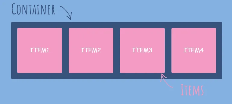
Let’s take a look at an example. Suppose we have a container with three elements, each containing an image and some text. We want these elements to be displayed side by side on larger screens, but stacked vertically on smaller screens.
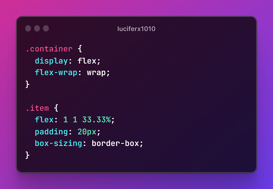
In this example, we set the container to display as flex and wrap the elements onto multiple lines if needed. We then set each element to flex-grow: 1, flex-shrink: 1, and flex-basis: 33.33%, which tells the browser to divide the container into three equal parts. We also set some padding and box-sizing for each element.
With these settings, the elements will be displayed side by side on larger screens and stacked vertically on smaller screens.
Other Flexbox Properties
Flexbox provides many other properties that you can use to customize your layouts. Here are a few examples:
- justify-content: controls the alignment of elements along the main axis
- align-items: controls the alignment of elements along the cross axis
- align-self: controls the alignment of individual elements along the cross axis
- order: controls the order in which elements are displayed
Conclusion
CSS Flexbox is a powerful tool for creating beautiful and responsive layouts. With its flexible and efficient approach, Flexbox provides a simplified and intuitive way to create complex designs. By using Flexbox, you can easily control the alignment, direction, order, and size of elements within a container, making it the perfect tool for creating responsive layouts that adapt to any screen size or device.
If you’re new to Flexbox, we encourage you to experiment with it and see how it can transform your web design projects. With its powerful features and easy-to-use syntax, Flexbox is sure to become your new favorite CSS tool.
 Dark Legion